
30 July 2019
Team Members: Anup S, Ibukun Akande, Cynthia Hoang, Shenghan Gao
Role: Largely fluid - Usability tester, writer, organiser.
Skills picked up: Usability testing, creating interactive mock-ups.
This project was completed as part of a Fundamentals of HCI course.
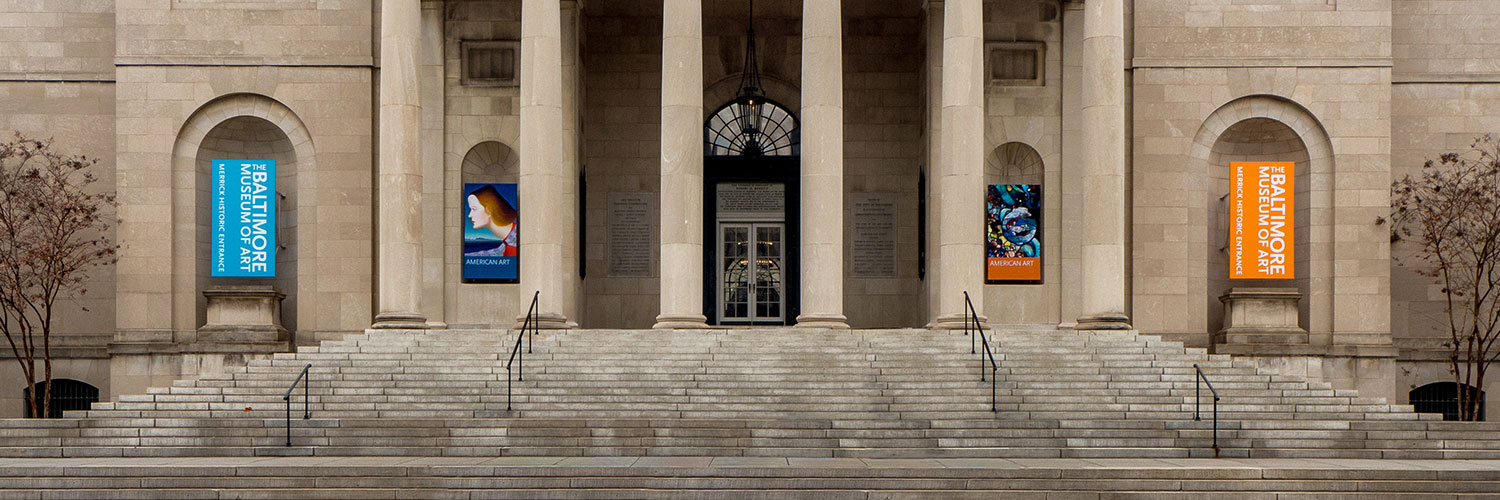
The Baltimore Museum of Art(BMA) uses GoMobile to provide visitors with the information and the interpretation they need to deepen their understanding of the art on display. This is achieved through a website that’s been developed for mobile use only.
BMA envisions GoMobile in 2 use cases:
In-museum guide: When a visitor is at BMA, the site can be used to get more information on the piece that they are interested in. When a visitor is in the museum, a visitor looks at the GoMobile logo on the label and realises that the piece can be viewed in the app. Not all pieces are added to the app.
Remote information: When a visitor is interested in the BMA or has visited the BMA, the site can be used to get some information that they missed or things that they want to review later.
This section describes the participants that were used to test the site and the employed testing methodology.
The main target audience for this site are museum-goers. Luckily, we had no issues with participant access for this study. All of our users were tested directly on-site at the Baltimore Museum of Art mid-day on a weekend. We sought after individuals who appeared to be walking or sitting alone and were fortunate that our users were friendly enough to cooperate with our usability test when approached. In total we conducted usability tests with 12 users over 2 rounds.
The current functionality of GoMobile mainly promotes on-site interaction with the artwork on display. Considering this, we decided in-the-wild user testing would be an ideal method to see how users interact with GoMobile. We also conducted remote user tests to gain insight about the site’s relevance off-location since that was a question of concern for the BMA staff. In preparation for our tests, we typed out a script that would introduce who we were, our purpose for research, as well as a set of questions and tasks we would instruct users with.
While creating the tasks that would be included in the evaluation, it was important that we developed tasks that tested all the major functionalities within the user interface. By going through the GoMobile site, we were able to identify the main interactions that a typical museum visitor will have with the interface. With that, we developed tasks to assess the usability of these functionalities within a typical user scenario.
Here’s what a sample task looks like.
6. Go to your favorites and email the list to abc@testmail.com
The full task lists can be found in the detailed report.
The first round of testing waas designed to test the existing interface. There were 7 tasks in total and 7 users were tested during this round.
The second round of testing was designed to test our improved interface against the current interface. We used 5 users for this round.
What you expect the user to do is most often not what the user actually does. For instance, after looking at the app, we assumed that older users would have a lot of trouble with reading the small font. But during our on-site testing, none of the elder users reported any problems with the font size. Younger users tried to empathize with elder users without any prompting and mentioned that older users might have problems with the font.
Pilot tests are important. After setting the task-list, we were fully confident that none of the users would have any trouble with understanding our intent behind the tasks. That was far from true. Like in the sample question mentioned above, one user went to the Favorites in iOS and not the Favorites feature of the app. None of us expected that to happen. Pilot testing with a small group of representative users can get rid of the small niggles with the usability test.
Not everyone can easily understand icons. One consistent issue that we noticed with older users was the issue of misinterpreting icons. Any small ambiguity was amplified when the user was older and this affected their performance.
Users try to look for a “home-base” when they feel lost. Everytime a user felt like things weren’t going according to plan, their immediate instinct was to go back home and explore again. This behavioural instinct can be used effectively to design better interfaces.
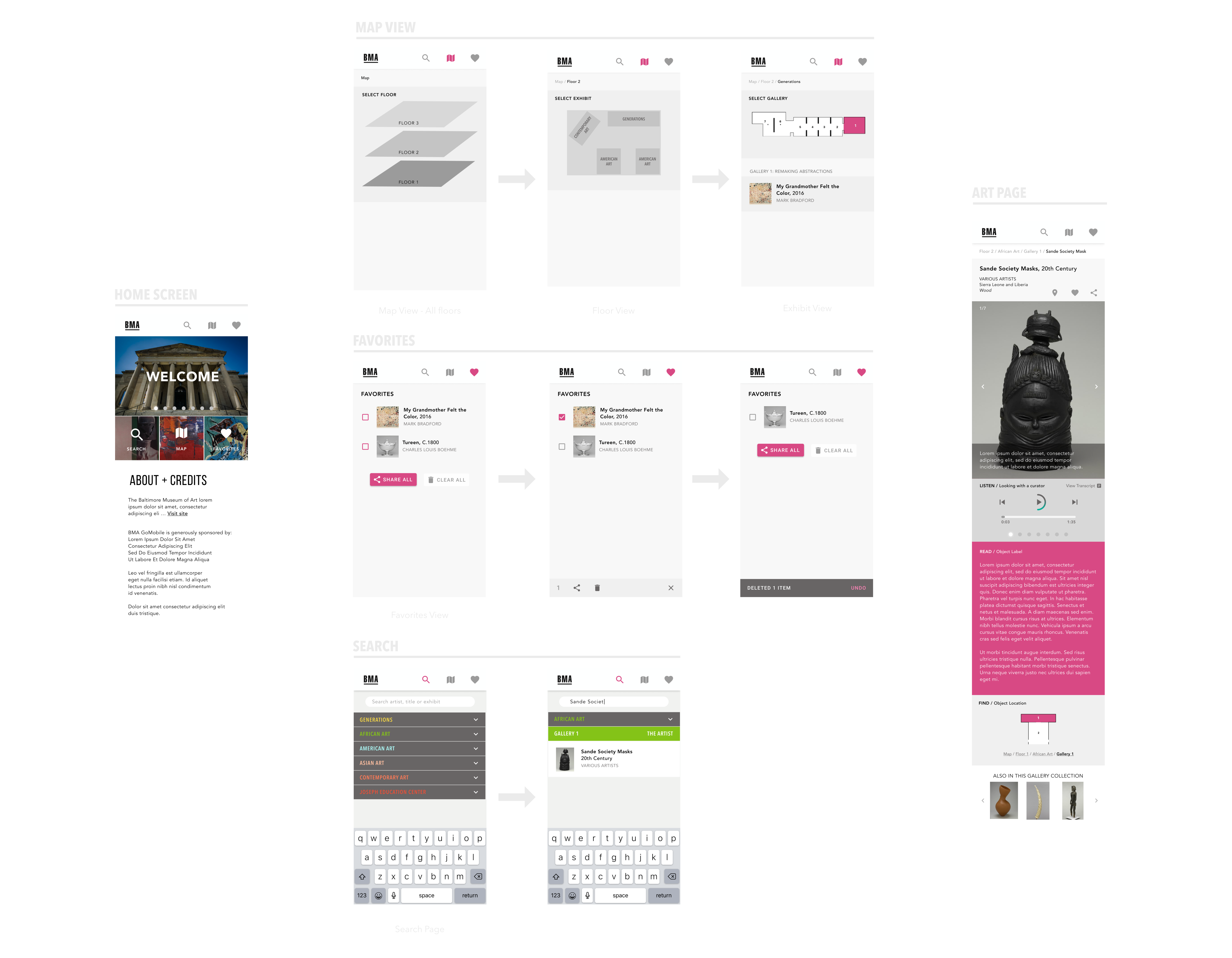
You can see an interactive prototype here.
Before the home screen was a blank page with a slideshow of random pieces at the Baltimore Museum of Art. For our improved version, we changed the page to a tile-based interactive home page that acted like a dashboard for users to fallback on if they felt lost at any point. Even though the main functions were easily accessible by the top bar, as mentioned above, we found that a lot of users went back to the home page by instinct.
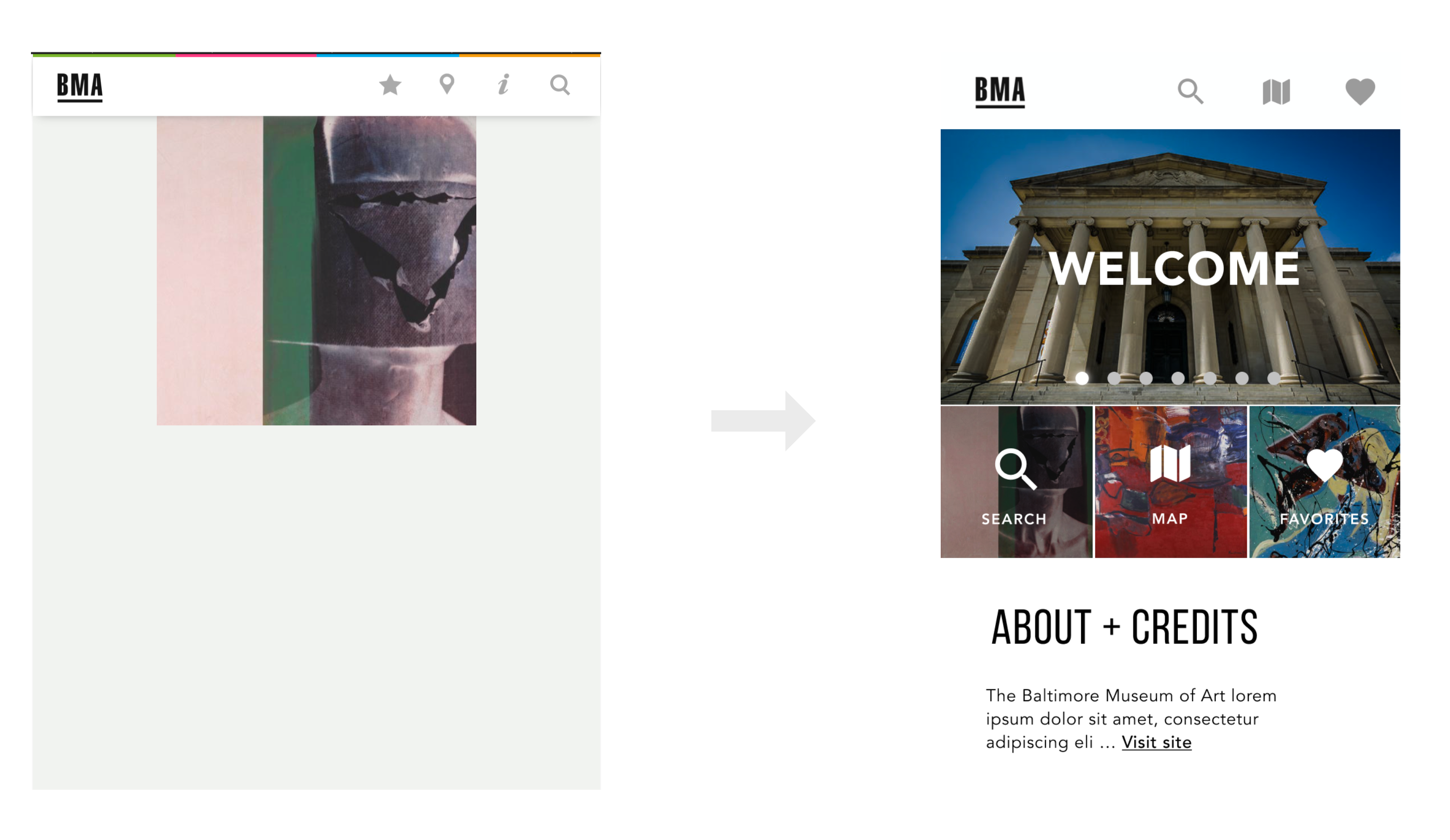
Changes to the home screen
We also changed the icons to better represent their functions. In the old interface, the “i” icon led to developer information which was of no use to any of the users. We removed that and moved that information to the bottom of the home screen. We replaced the map icon as some older users mistook it for a search icon.
This is more of a functional change. In the old interface, the user had to search for the item and then tap the exhibit to get the search result instead of the search result showing up directly. Plus, you also can’t search by exhibit name which is not very user friendly.
Old version needs a extra click to show search results
The “email favorites” button on the old page was too small and the functionality was limited. We propose a few changes to this page.
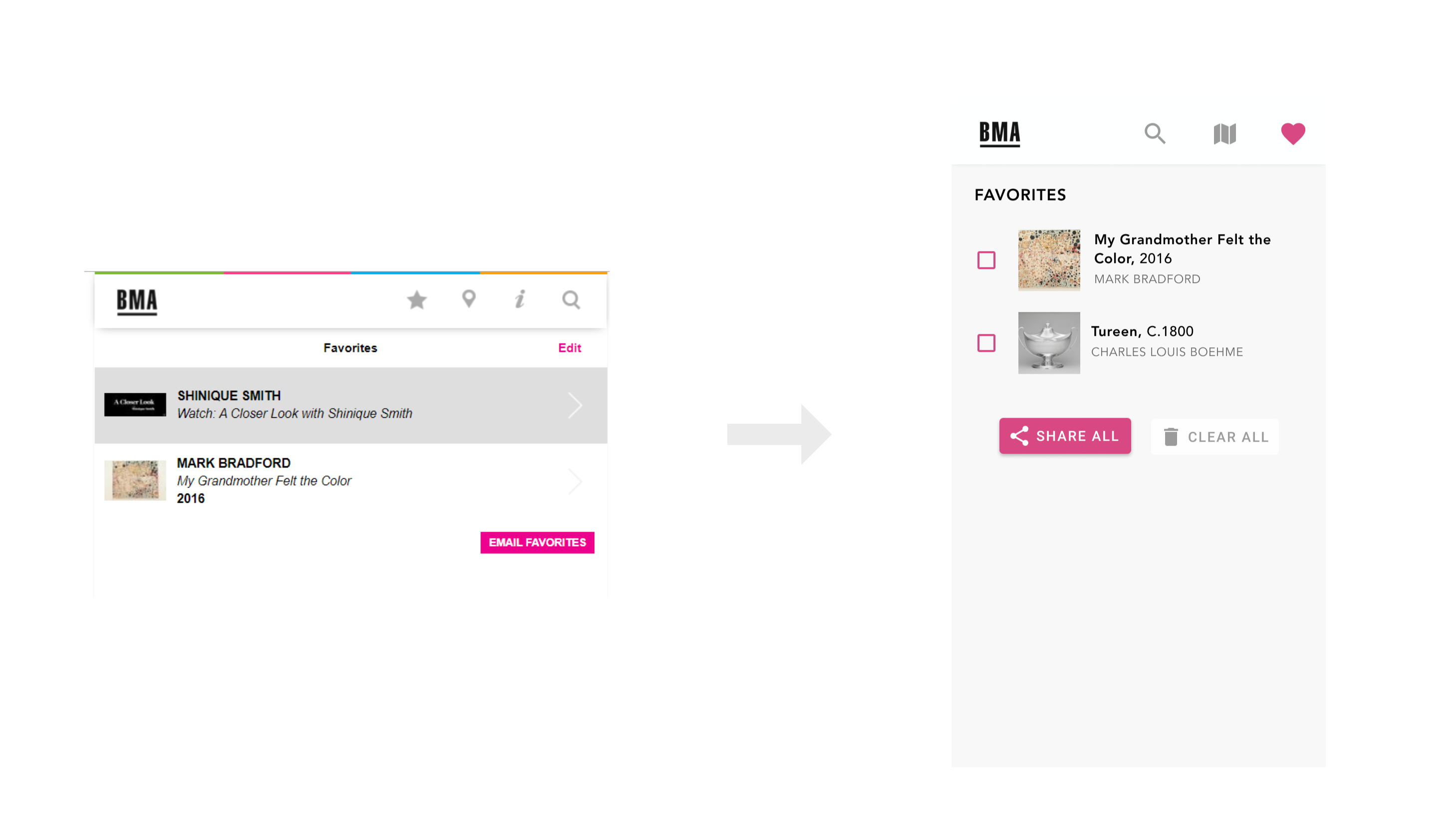
Old Favorites page didn’t perform the necessary functions adequately.
The other changes can be seen in detail in this document.
The changes that we made were largely useful and this is very evident from the task and time performance(see document for detailed figures). The original site led to a lot of failed tasks and the time performance wasn’t that great either. Our improved interface led to multiple fold improvement in task completion and time performance.
Testing with representative users is more important than you think. Although the changes that we made are fairly obvious and having a good eye for UX can point out a lot of these issues, testing with representative users allows other problems to be highlighted. It’s almost impossible to look at the product through everyone’s eyes. Good taste, the skills to match that taste and experience can go a long way, but testing with actual users is the only way to comprehensively understand the pain and pleasure points.