
Creating an experience for Facilities Management
Your school wants to improve the upkeep of campus facilities by creating a new system for reporting any facilities that may need maintenance or repair. Design an experience that allows students to report building or equipment issues on campus. Consider the process of those filing the report and of those receiving and taking action on the issues.
In this document, I go over the process I followed to complete the design challenge and try to explain the rationale behind the choices that I made and the thought patterns that led to these decisions. I spent about 12 hours on this exercise over the period of 5 days.
Before I get to actually designing the interface, let’s try and breakdown the “Why?” behind it. Setting a strong why behind the project makes it easier to make smaller decisions down the line and it also makes it easy to start off with the interface as you start picturing the things you want to build while you’re thinking about the why.
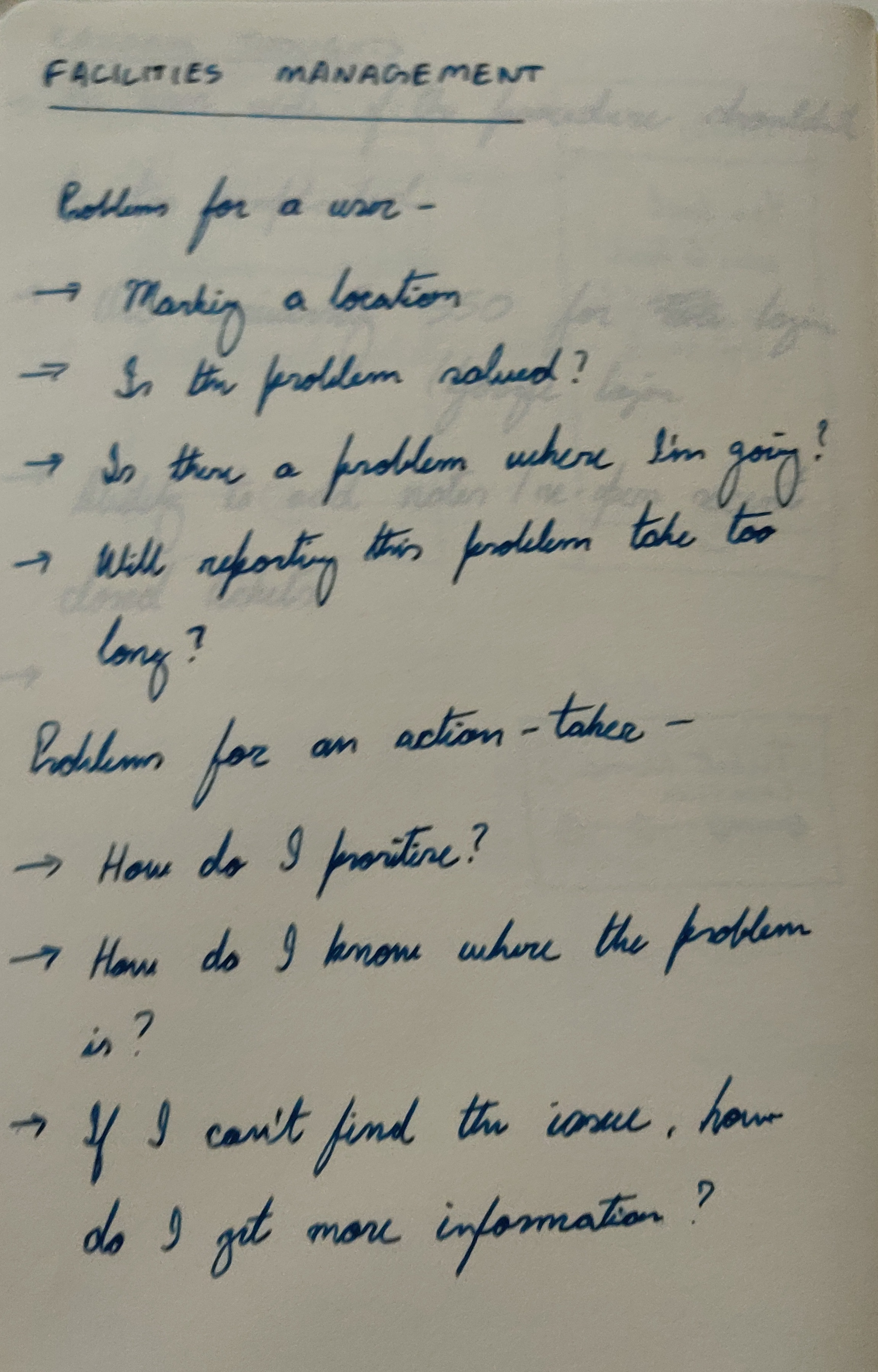
I put user interviews in quotes because they weren’t structured well enough to be a proper user study. I was just asking questions to figure out the major challenges that a user faces while trying to get something fixed.
“Creating the ticket was straightforward, but I didn’t know what was happening with my ticket after I created it.”
From the 2 small interviews, it was evident that a major problem is getting information on how the ticket is being handled. Giving appropriate information to users when they need it is a major part of interaction design.
One way to think about the main problem is the jobs-to-be-done concept from the Innovator’s Dillemma by Clayton Christensen. What’s the job to be done here?
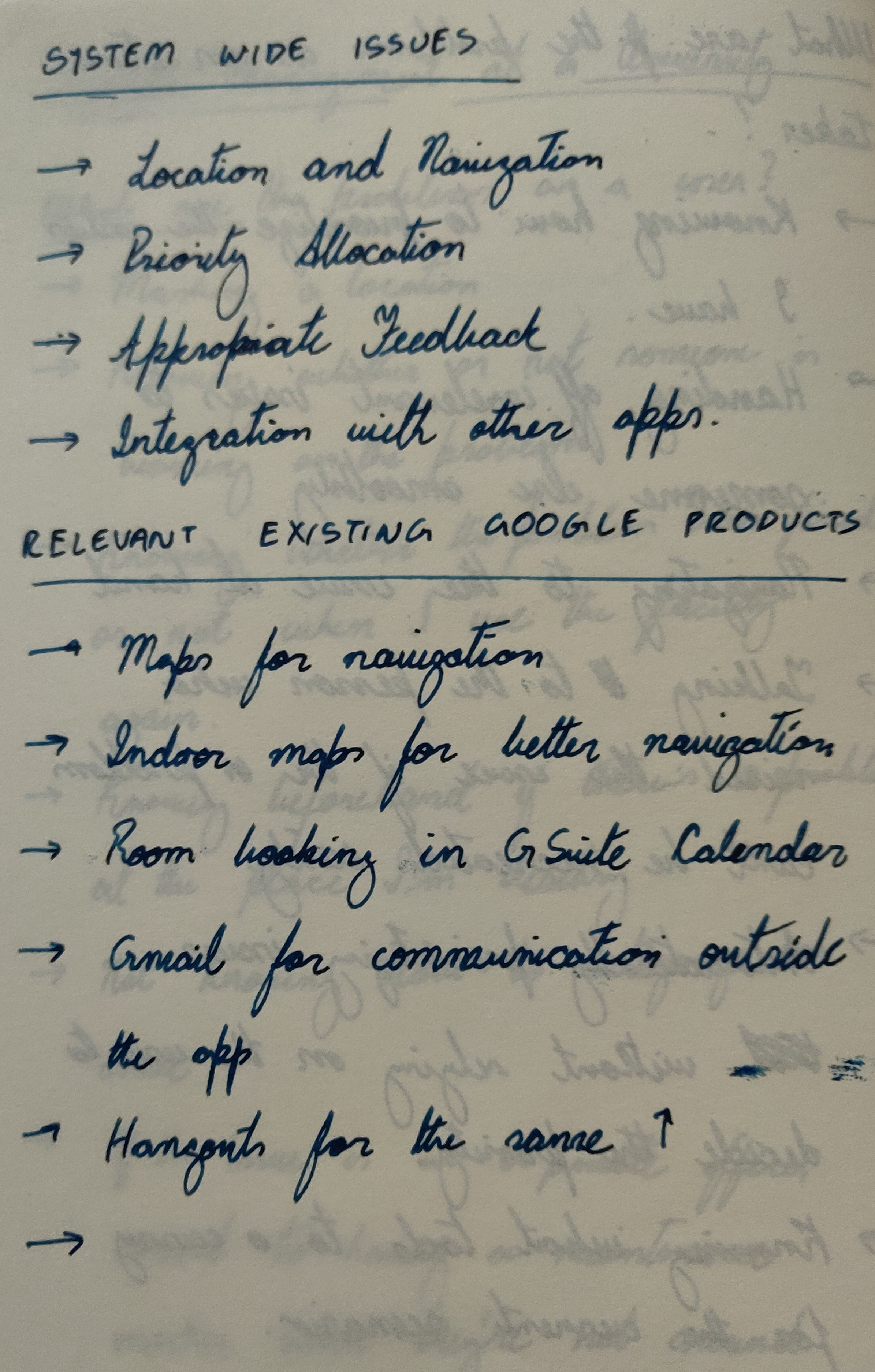
Goal 1 and 2 can be solved with the interface that’s being built. Goal 3 needs help from the other apps in the Google Suite.
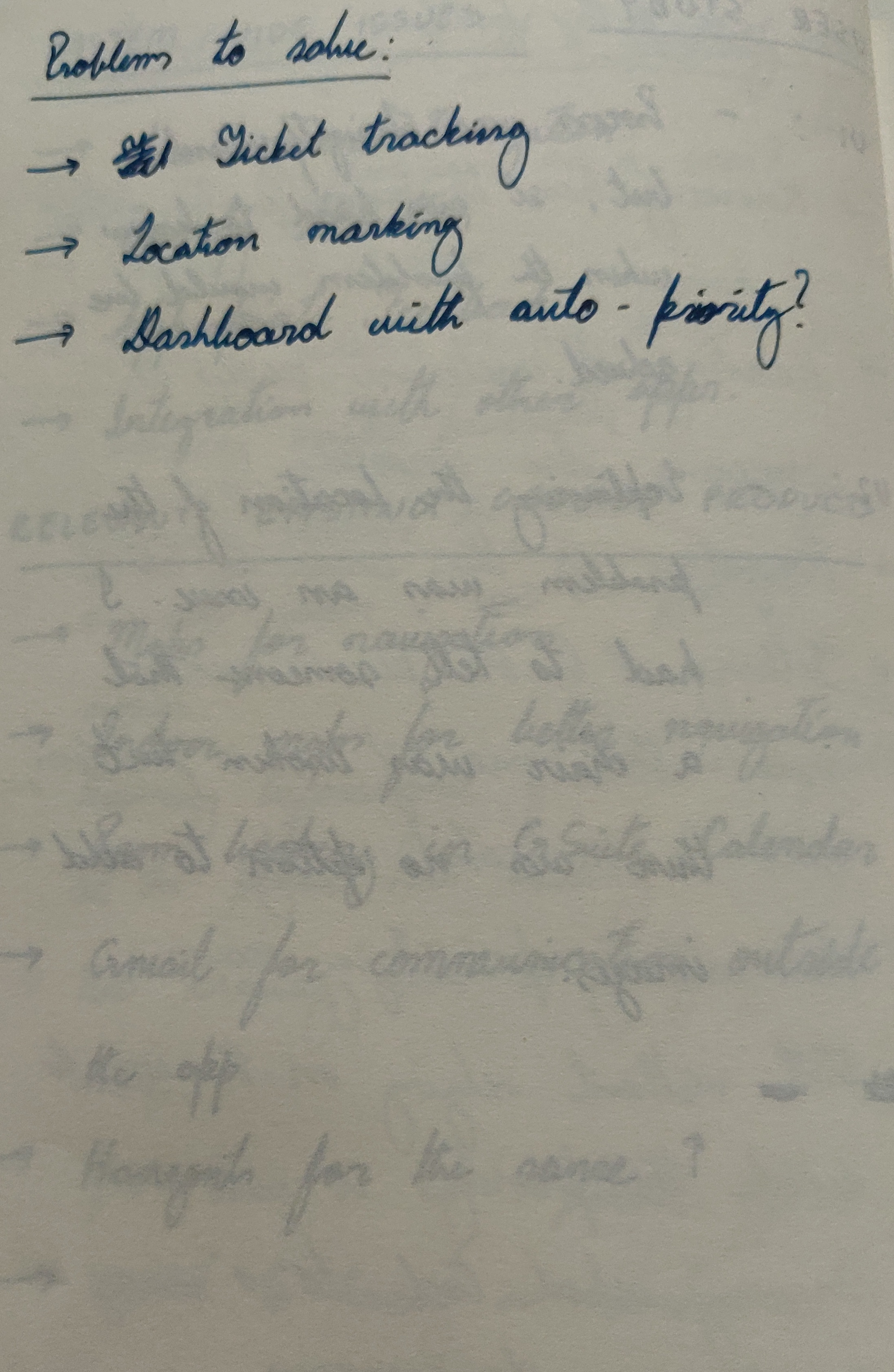
A main problem while creating tickets is categorizing the tickets adequately. If the number of tickets are really low, categories aren’t really necessary but when dealing with a large number of tickets, not having categories affects scalability.
To get around this issue, the tickets can be categorized automatically using NLP. By analyzing the keywords in the title and the description, the tickets can be categorized and sent to the relevant action-takers.
I’m assuming that this NLP system exists and that the appropriate tickets are sent to the right action-takers.
The tickets can also be grouped by location and sent to action-takers that handle those particular locations.
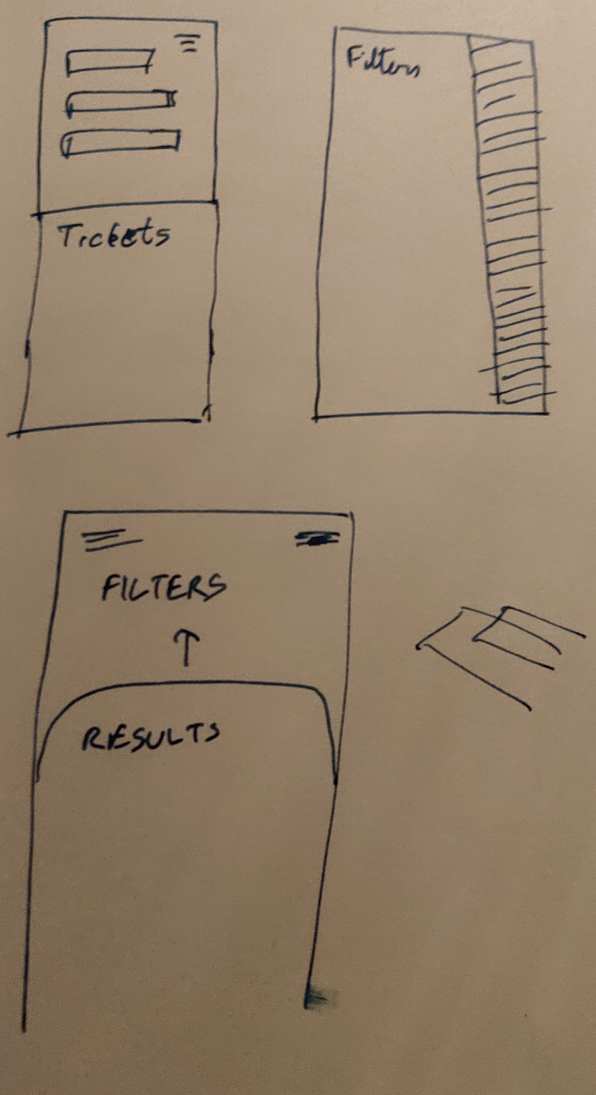
Making wireframes is a good idea as it lets you focus on the interaction design aspect and not worry about the visual design.
This section and the following sections can be divided into the user side and the action-taker side.
The user’s needs essentially boil down to creating tickets easily and knowing the status of the tickets they’ve created.
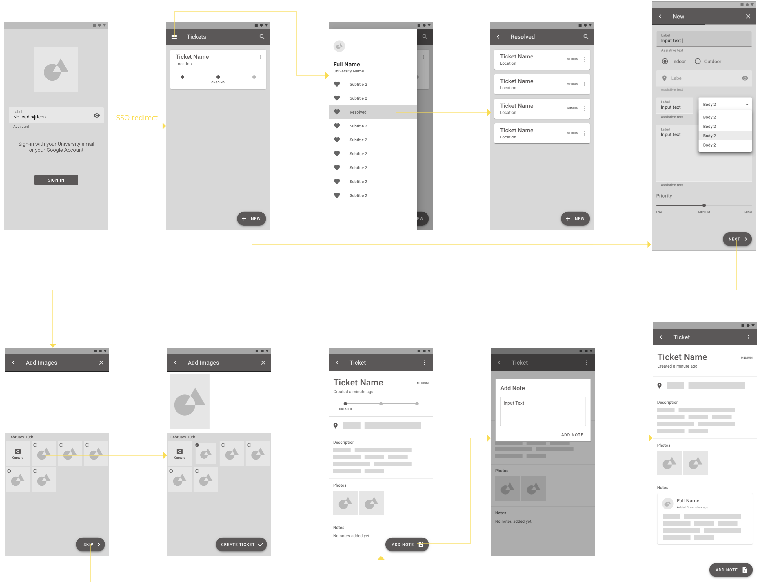
Most Universities now use an SSO(Single Sign-On) to let students access the tech facilities at a University. My University also uses the GSuite. This makes things easier in terms of login and onboarding. As user preferences and other settings are irrelevant to the task at hand, the on-boarding process is as simple as having a log-in screen with an email to check whether a person can use SSO or if they need to log-in with Google.
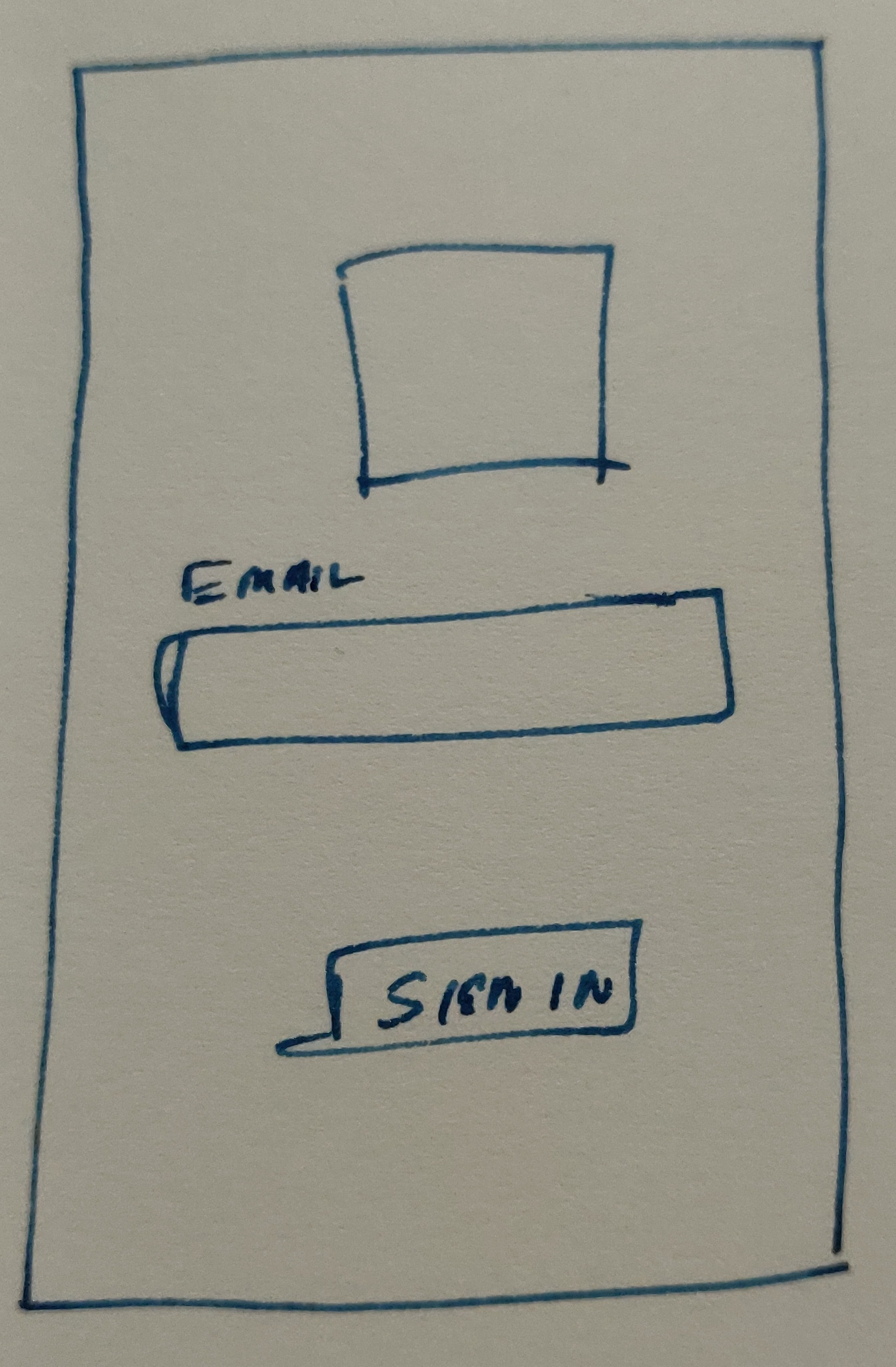
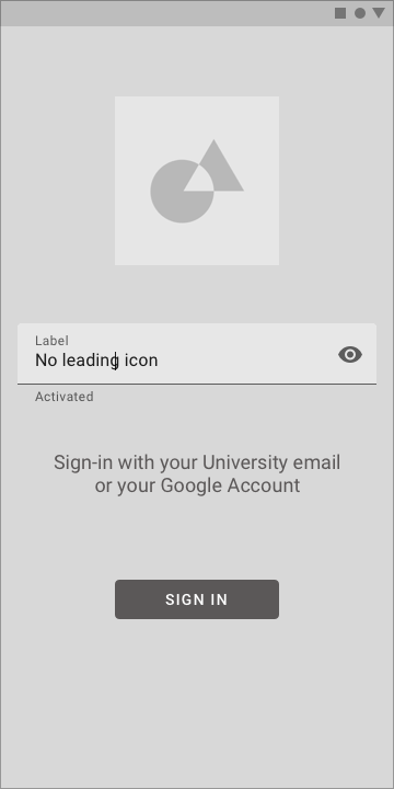
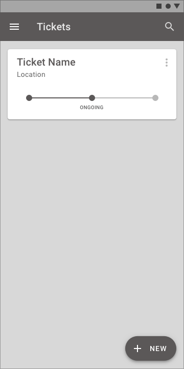
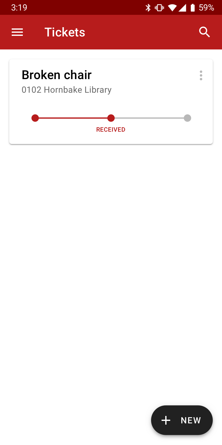
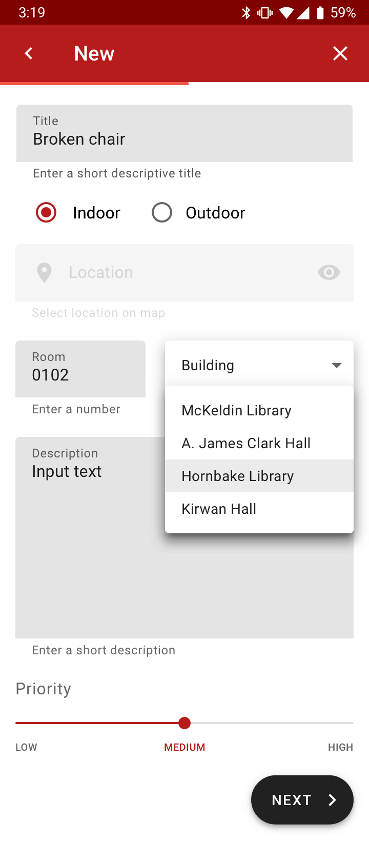
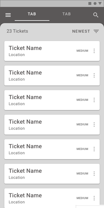
As a user, the only thing that matters is the tickets you raise for the issues you’re having. The interface directly goes to a home-screen with the open tickets. The FAB is used to create a new ticket.
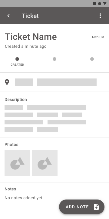
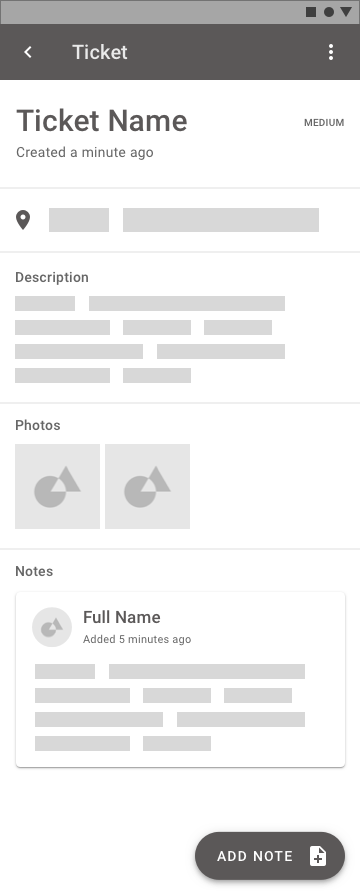
This page also has the open tickets with the status currently displayed directly on the homepage. Each ticket can have a status of “CREATED”, “ONGOING”, “COMPLETED”. This allows the user to understand what’s happening with the issue that they logged.
Users can be notified when their ticket moves through the stages with a small explanation about the stage.
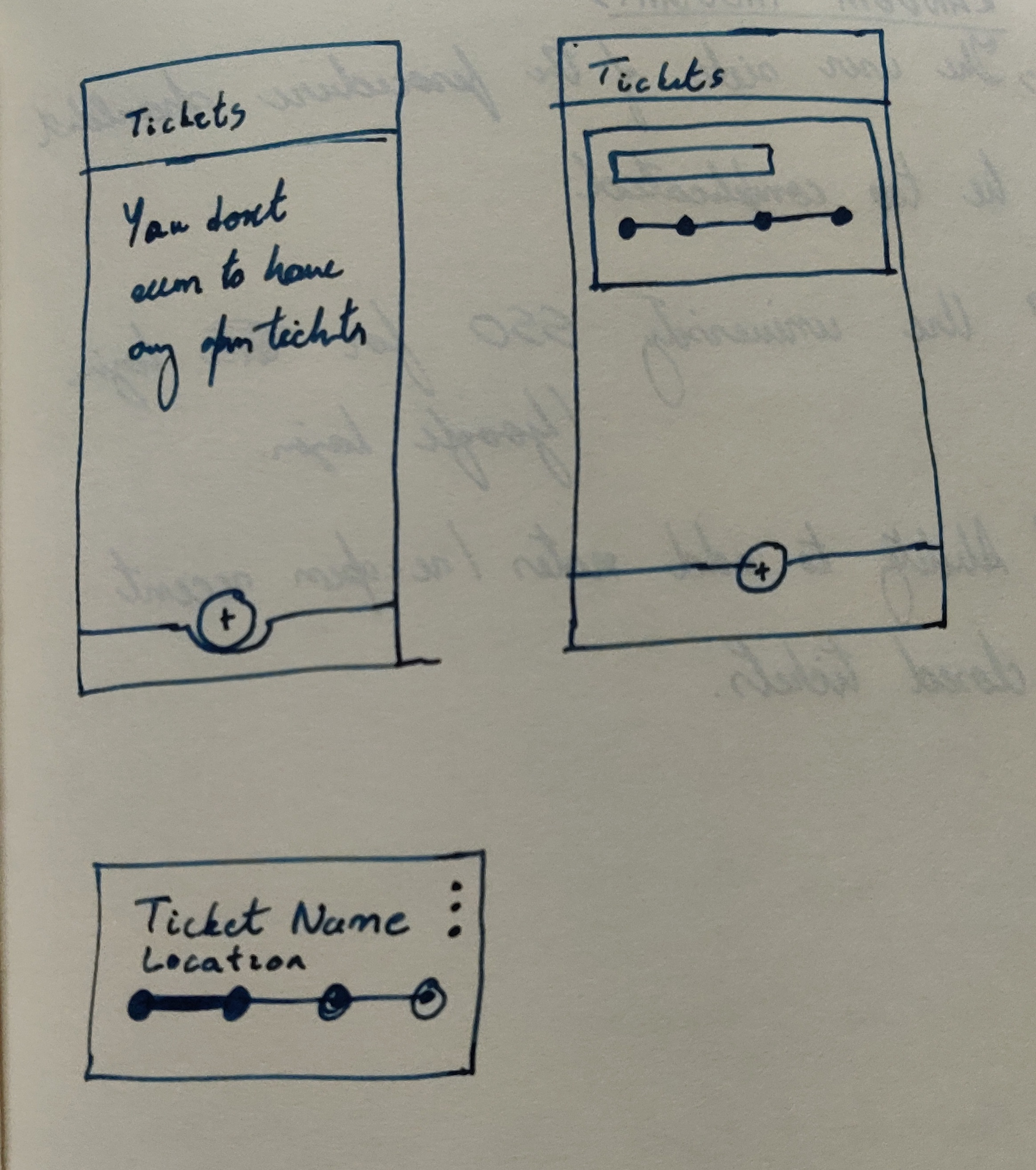
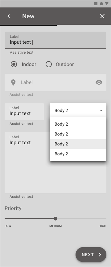
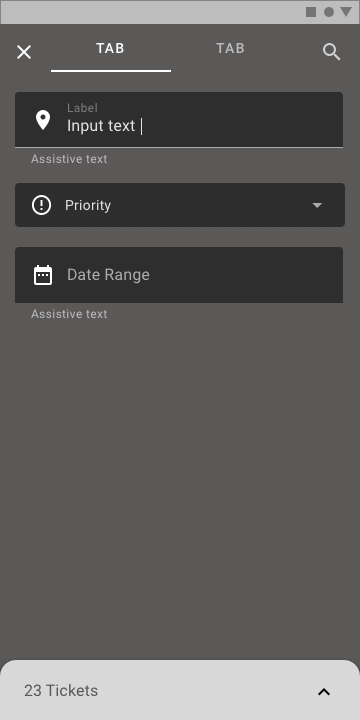
I pondered over making a wizard for ticket generation, but I eventually decided not to as the wizard would make it seem like there’s more to the process than there actually is. Having pretty much everything that you have to fill out on a single page is less daunting than looking at a progress bar with multiple pages so I decided to go with a simple form.
The form allows the user to mark a location using GPS if the issue is outdoors, but if it’s indoors, the dropdown allows the user to select a building and enter a room number. Luckily, rooms at a University are usually numbered adequately and this makes indoor navigation easier.
One of the major things that I wanted to keep in mind, was setting the priority of a ticket. I initially thought a 1-10 scale would be a good idea as it would allow for better sorting on the action taker side, but having a user decide between 1-10 puts too much cognitive load on the user and it leads to more misclassification. So I decided to go with a LOW, MEDIUM, HIGH slider.
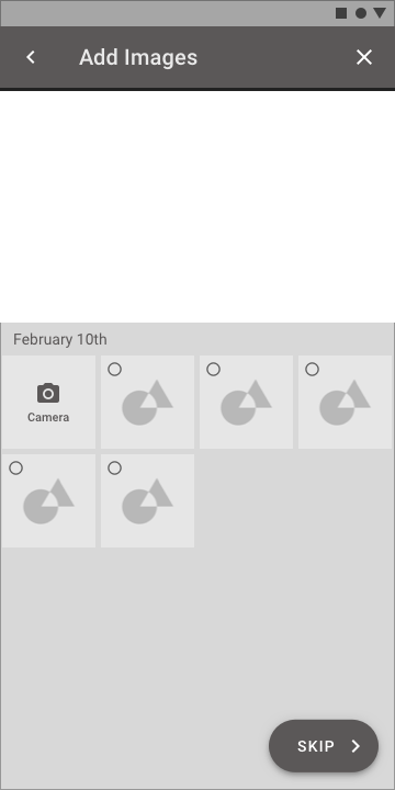
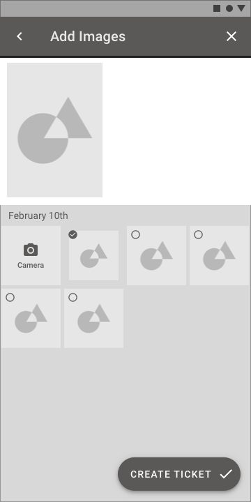
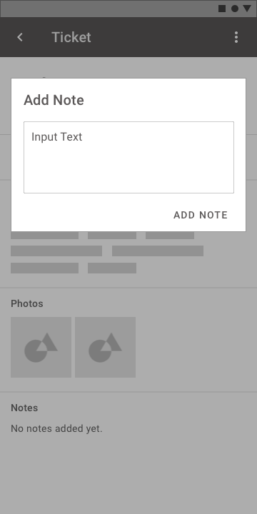
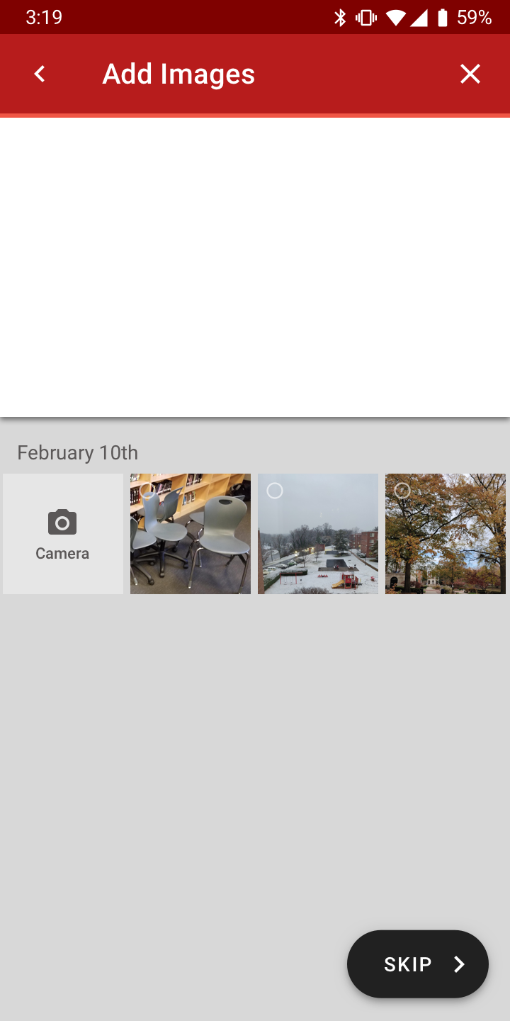
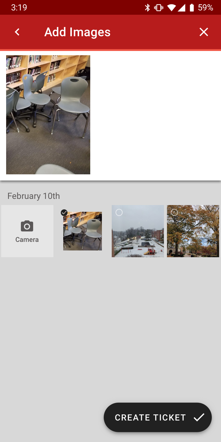
I did make a new page to add pictures as having the “add picture” button on the same page looked cluttered. Adding a picture is also optional as users might not be comfortable with taking a picture at a private location like a bathroom.
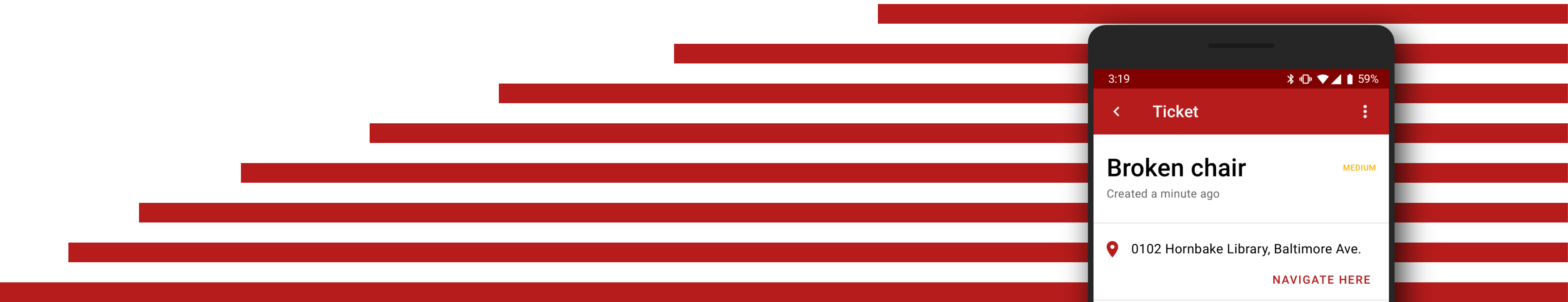
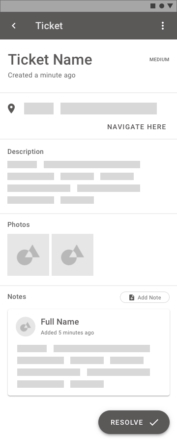
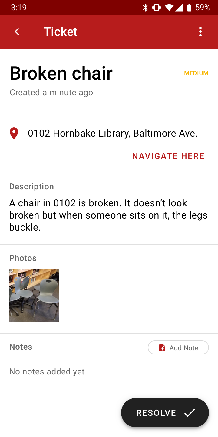
The ticket screen for the user only displays the information with the ability to add notes if and when needed. This allows the user to communicate with the action-taker when needed.
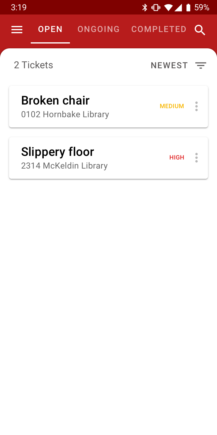
I created a few high-fidelity images of the main screens. I chose the Material Design red because that matches my University’s color scheme.
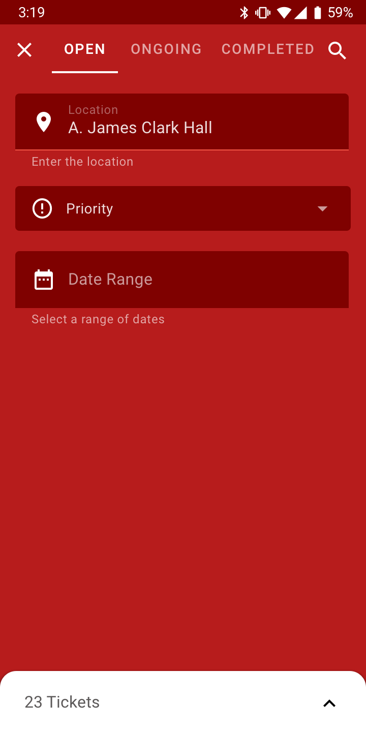
The action-taker deals with many tickets at the same time. So the problem changes to finding and handling all these tickets effectively. To make this possible, I decided to use the Material Design Backdrop design pattern to create a filter backdrop for the tickets which are then displayed on the foreground.
The main screen that an action taker would see as soon as they open the app is the open tickets page. The tabs above let the user switch between open, ongoing and completed. Open and Ongoing will be the most used tabs but having a separate interaction pattern for completed doesn’t make sense so I added it to the same area.
The action-taker has different expectations from the ticket screen as they have to navigate to the problem physically, but also resolve the ticket or add more notes to communicate with the user. This adds a few changes to the interface and it gets rid of the ticket status.
When an action-taker clicks on a ticket in the open section, it moves the ticket to the ongoing status as it implies that the action-taker has taken a look at the ticket. This allows the action-taker to control the tickets they want to work on at any given point of time without having to manually notify the user about each stage.
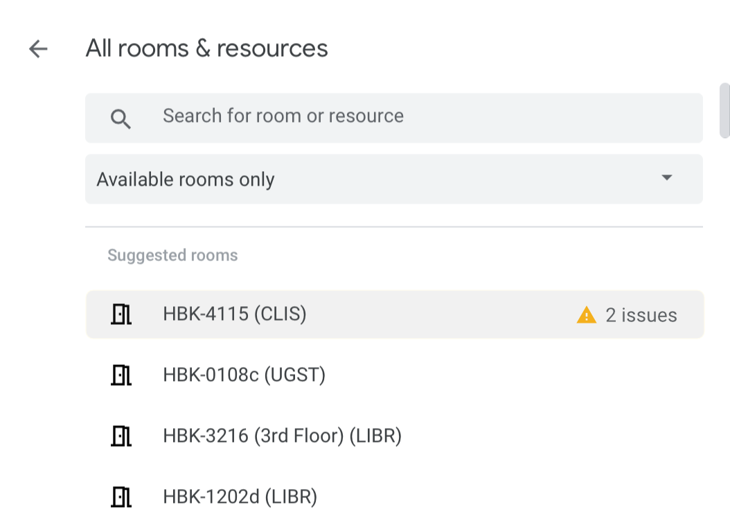
If this app was integrated into the GSuite for enterprises, a lot of cool features could originate from this. For example, Google Maps could list the problems with the building for people within the organisation so that users can plan their trip accordingly. Google Calendar has a room booking option for meetings which could have a feature that listed the issues with the room when someone tries to schedule something in it.
Using the data from this app to enhance the experience of other apps in the GSuite can improve the experience for users across the Google app catalog.
A couple of weeks ago, I booked a room to sit alone and write some code. If I’d known beforehand that the plugpoint wasn’t working in that room, I wouldn’t have wasted 25 minutes looking for a different place to work.